Wix
Making the Blog Post Page More Flexible
Company
WIX
Role
Product Designer
Scope
Post page layout redesign
Presets and ready-made layouts
Element-level customization
Integration with Wix Blocks
Testing and gradual rollout
Context
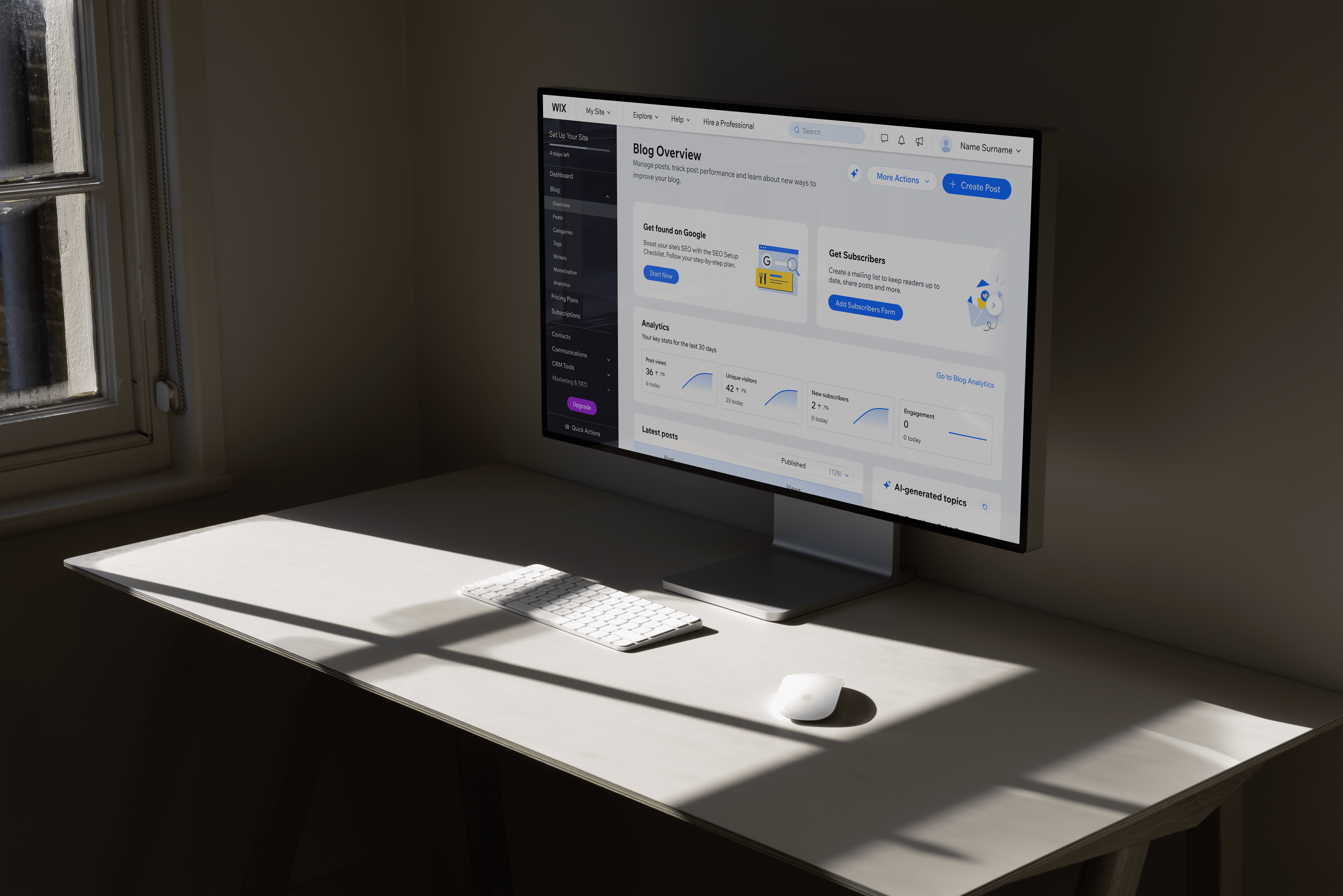
The Wix Blog post page worked well for simple articles, but it didn’t offer much layout flexibility.
As more advanced users and agencies started building complex blogs, we needed to give them more control without overwhelming everyday creators.
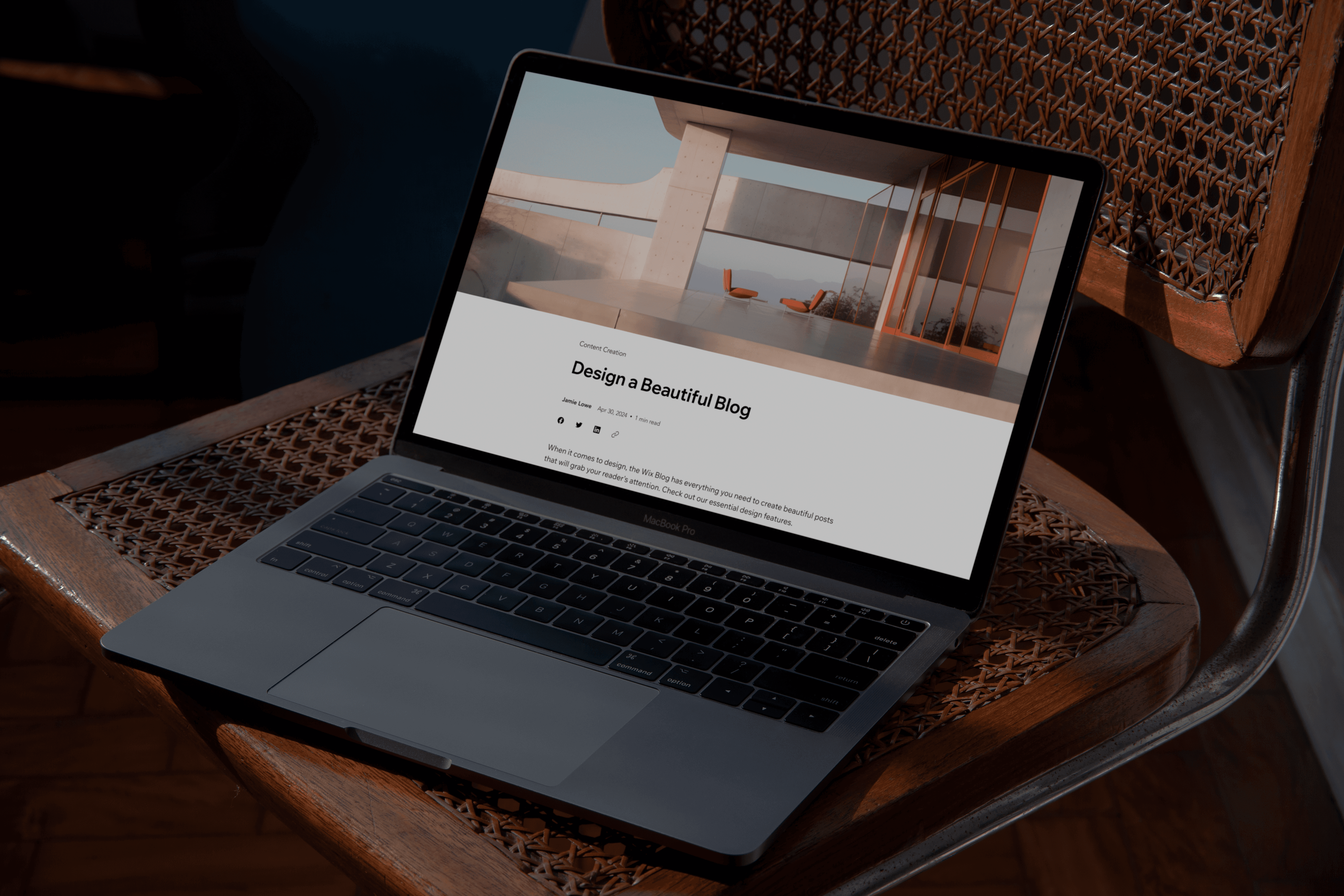
Updated post page
Problem Area
Rigid Structure and Technical Limits
The post page was too rigid. It worked fine for simple articles, but didn’t offer much layout flexibility. Users who wanted more control had to rely on workarounds.
There were also technical limitations. In Wix apps like Blog, users couldn’t edit individual components directly in the editor. They could only adjust settings for the entire widget as a whole. This made deeper customization difficult.
We needed to add flexibility without making the editor more complex.

Post page before
DESIGN GOALS
What I aimed to achieve
Break technical limits
Move from a single fixed widget to editable blocks so each part of the post can be customized independently.
Design Desicion 01
Rebuilding the post page as independent blocks
Rebuilding the post page as independent blocks. The existing post page was built as one fixed widget. To unlock real flexibility, we rebuilt it using Wix Blocks.
Wix Blocks was a new internal technology that allowed apps to be built as independent, editable components inside the Wix Editor. Our team was one of the first in Wix to implement it in a production app.
As the product designer, I had to deeply understand how Blocks worked. With support from the Wix Blocks team, I structured the post page as separate components and built the initial front-end layer myself.
Developers later started to connect those components with settings logic and ensure everything functioned correctly inside the editor.

2. Global settings → Component control
Each element could now be customized separately.
3. Rigid structure → Real flexibility
Deeper layout control became technically possible.
Design Desicion 02
Introducing presets for fast setup
While rebuilding the post page structure, it was important not to force users into manual customization.
Many creators just want their blog to look good quickly.
So instead of starting from a blank layout, we introduced ready-made post page presets.

Why presets mattered
1. Faster blog setup
No need to configure every detail manually.
2. Less cognitive load
Users didn’t have to decide everything at once.
Design Desicion 03
Refining the system through iteration
After rebuilding the structure and introducing presets, the work wasn’t finished.
Each component required clear and consistent design settings. I created detailed specifications for the header, metadata, categories, content, footer, and visual styles to ensure flexibility remained structured and usable.

What this meant
2. Cleaner defaults
Presets were refined based on competitive research and internal reviews.
Validation
Testing with real creators before release
Before rolling this out widely, we tested the new post page with template designers and blog partners. We wanted to understand how people actually work when designing a post page.

Key findings
3. Drag-and-drop expectations were high
Some users expected full layout freedom, which informed future roadmap decisions.
Release
Gradual rollout
What changed after first rollout
Retrospective
What happened after launch
After launch, performance issues tied to the new Blocks structure forced us to temporarily revert to the previous version.
While this wasn’t the outcome we planned, the project exposed key technical limitations of the new system and helped other teams understand what needed to improve.
At the same time, research confirmed that users want deeper layout flexibility, giving the team confidence to continue investing in this direction.
Post page - before vs after